
Picking interior colors for a room that already feels tight is one of the most common decisions Omaha homeowners wrestle with before a repaint. The right wall colors can make a small bedroom, hallway, or living room feel noticeably more open without knocking down a single wall.
The wrong ones can take a perfectly decent room and make it feel like a closet. Knowing which colors work in your favor before you buy a single gallon can save you from a repaint you did not plan for.
Key Takeaways:

Why Wall Paint Colors Affect How Large a Room Feels
Color influences perceived room size through a measurable concept called Light Reflectance Value, or LRV, a 0 to 100 scale for how much light a color reflects. Colors near 100 are bright and reflective; colors near 0 absorb most of the light that hits them.
Higher LRV means the color reflects more light, which has a real impact on how spacious a room feels. In small rooms, colors with an LRV above 70 create a sense of openness by bouncing light back into the space, making the walls seem farther apart. Colors below 30 absorb light and can make a small room feel even more enclosed.
That does not mean every room needs to be white. It does mean the colors you choose carry real, measurable weight in how spacious the space appears. Getting the base right starts before the topcoat, which our guide on why paint primer matters covers.
Wall Paint Colors That Make a Room Look Bigger
Soft Whites and Warm Off-Whites
White is the most reliable option for opening up a small room. The first rule for using color to feel more spacious is to choose a hue that recedes into the background, and the right white does that better than anything, with the walls seeming to nearly vanish while reflecting light back into the space.
There is a nuance. A bright, cool white, the kind that looks almost blue from the can, can make small rooms feel smaller, because every shadow, corner, and imperfection reads sharply against true white and makes the edges more visible.
Creamy off-whites with warm yellow or pink undertones read as light without the harshness. Sherwin-Williams Alabaster, Benjamin Moore White Dove, and Benjamin Moore Swiss Coffee consistently perform well in rooms with limited natural light.
Pale Blues and Soft Gray-Blues
Airy blues pair beautifully with crisp white and work well in small spaces, because blue recedes and gives the illusion of opening the room up. A pale, icy blue adds lightness and pulls the walls outward, much like white does.
These work especially well in bedrooms and bathrooms where you want a hint of color without sacrificing the sense of space. Farrow and Ball Pale Powder, Sherwin-Williams Zircon, and Benjamin Moore Smoke are worth sampling.
Warm Grays and Greige Tones
Warm gray and greige, a gray-beige blend, are practical picks for Omaha homeowners who want something more interesting than white but still need the room to feel open. These tones sit in the mid-to-high LRV range, so they reflect a solid amount of light while adding warmth a stark white lacks.
They also pair naturally with the warm wood tones and neutral flooring common in newer builds across Papillion, Gretna, and Elkhorn. For how colors shift as they dry on your walls, our post on does paint dry darker or lighter breaks it down before the job is done.
Soft, Pale Yellows
Soft yellow is a good choice for small rooms with limited natural light. To open the room up, reach for a pale yellow rather than a deep, saturated shade. Pale yellows carry a warmth that makes artificial light feel brighter, which matters in rooms that do not get much direct sun.
The Same-Color Trick That Amplifies Any Color
One of the most effective ways to make a room feel bigger has less to do with which color you pick and more to do with where you stop using it. Painting walls and ceilings the same color removes visual breaks and makes the room feel larger.
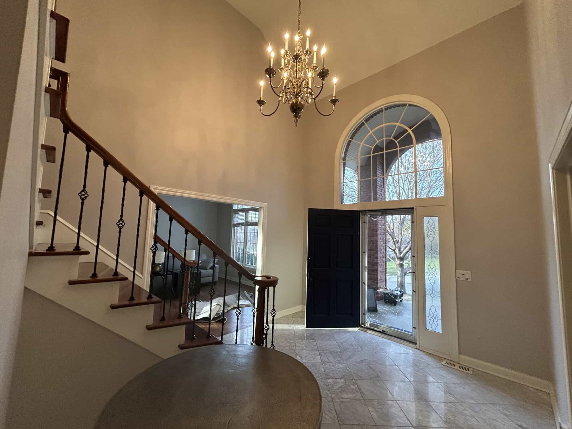
If you prefer to keep the ceiling lighter, a bright white overhead still opens the space. Either way, reducing the contrast between wall and ceiling removes a hard line that draws attention to how low the ceiling sits.
The same applies to trim. When the trim sits close in tone to the walls, the eye reads the surface as continuous rather than framed and boxed, and that single adjustment can do more for perceived size than switching color families. Our roundup of interior painting tips pros follow covers more of these details most people skip.
3 Color Choices That Make Rooms Feel Smaller
Most articles tell you what to do. Fewer tell you what to avoid. Here are three situations where color works against you.
1. Saturated Dark Colors on All Four Walls of a Low-Light Room
In a dark, poorly lit room, a dark color’s low LRV further reduces the available light and makes the space feel smaller.
This does not rule out dark shades. Deep navy, charcoal, and forest green look striking in rooms with large windows, high ceilings, or layered lighting. But covering all four walls of a small Omaha bedroom or narrow hallway in a dark color, with no extra lighting to compensate, is a fast way to make it feel enclosed.
If you are drawn to moody, saturated shades, use one as a feature wall instead of all four. A deep navy or an unexpected jewel tone on a single wall can actually make a room look larger by creating the illusion of depth.
2. Highly Saturated Bright Colors on All Walls
Bold, saturated oranges, reds, and vivid greens tend to advance visually. They feel like they are coming toward you rather than receding, and that push makes the walls feel closer than they are. These colors work well as accents, but on all four walls of a compact room they usually make the space feel tighter.
3. High Contrast Between Wall Color and Trim
High contrast on ceilings or moldings is a common mistake. Slightly lighter, closer tones create more perceived space instead of a box-like effect.
When the trim is bright white and the walls are a medium or dark tone, the eye locks onto every corner, seam, and edge, which clearly defines the room’s boundaries, the opposite of what you want in a small space. Choosing wall colors close in tone to the trim removes that hard visual border.
Finish Matters, Not Just Color
The sheen you choose affects how much light your walls reflect, which ties directly to how large the room feels. Eggshell and satin finishes reflect light and create the illusion of more space, and in small, low-light rooms a bit of gloss adds reflectivity.
The tradeoff is that higher sheen shows wall imperfections more, so it is worth weighing against the room’s condition. For a plain-language comparison, our post on satin vs matte paint finishes walks through the differences before you commit to a sheen.
Test Before You Commit
Sample your chosen colors on your actual wall. Paint chips are too small to show how a color behaves in your room’s light, and they cannot show how it reads morning versus evening, or under natural versus artificial light.
If you want to preview colors before spending a dime, our roundup of free paint color visualizer tools covers five options that let you test colors on a photo of your actual room. One more thing worth knowing before you finalize: paint dries differently than it looks wet, and how much depends on the color and finish.
How a Professional Handles Wall Paint Color Selection
Choosing colors is not just picking something that looks nice on a chip. You are weighing the room’s light direction, ceiling height, flooring tone, adjacent room colors, and finish all at once, and getting one variable wrong can mean a repaint you did not budget for.
Per Angi, interior painting can return around 107% when the job is done flawlessly, which makes getting the color right the first time worth the extra care. The decisions you make now matter well beyond how the room looks tomorrow.
At Kieser’s Painting, Evan Kieser and the team work directly with homeowners across Omaha, Papillion, Elkhorn, Gretna, Bennington, and Bellevue to choose colors that fit a room’s actual conditions. Every project is backed by a 2-year or 5-year workmanship warranty, so the color is not the only thing you can feel confident about.
If you are ready to stop guessing and get wall colors that actually work for the rooms in your home, contact Kieser’s Painting at 402-866-8260 for a free consultation and take the guesswork out of the process.